Patchwork Nation app for iPhone and iPad
Developer: Jefferson Institute
First release : 12 Nov 2012
App size: 118.14 Mb
If you travel the USA enough and pay attention to its complexities and differences you soon realize that the ways we try to understand it – red and blue, Northeast and Midwest – are too simplistic. They are inadequate and misleading.
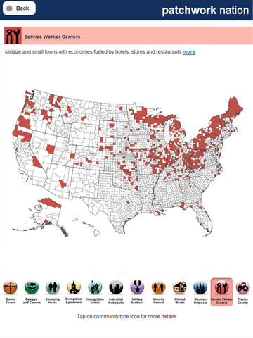
Patchwork Nation delivers national data with local context while remaining visually intuitive for the reader. The interactive maps help break down national data to analyze how it impacts communities. We put data in the hands of the user, to compare different data sets and explore national data county-by-county.
Launched to cover the 2008 election and originally developed and hosted with the Christian Science Monitor, Patchwork Nation has evolved to cover more communities and more topics, focusing on the economy and culture as well as politics.


